
Siding color makes a significant contribution to your home’s curb appeal. The siding color alone can make a home look classic, crisp, and fresh; traditional and refined; laid back and contemporary; unoriginal and generic; or dated and drab.
This is one home renovation choice that you want to get right. If you have a siding project coming up, take a little time to review these tips for choosing the right color.
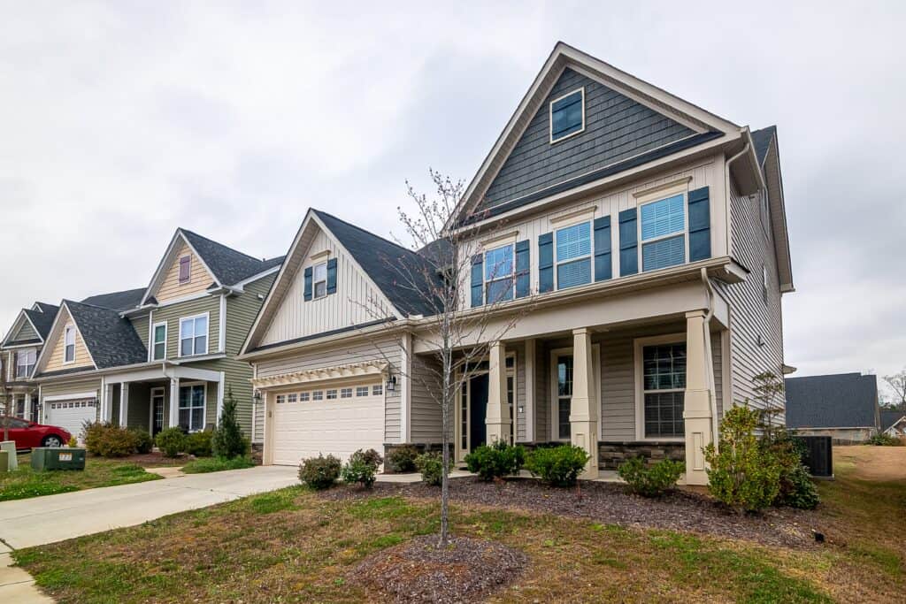
Popular Siding Colors in Charlotte, NC
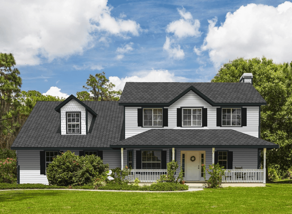
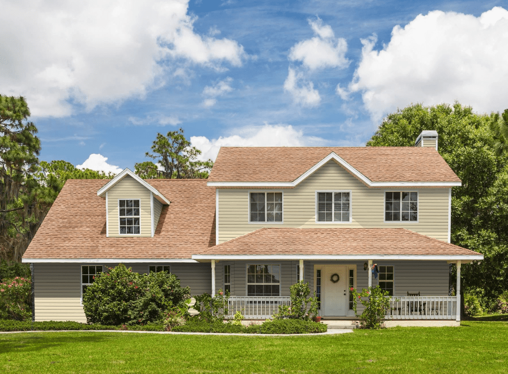
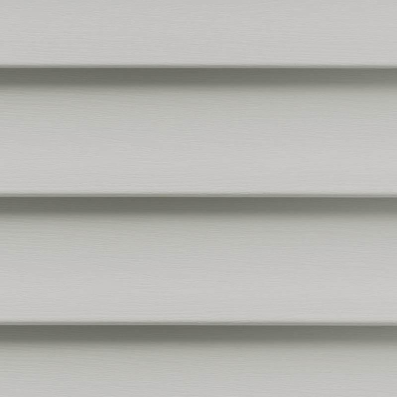
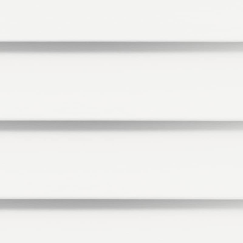
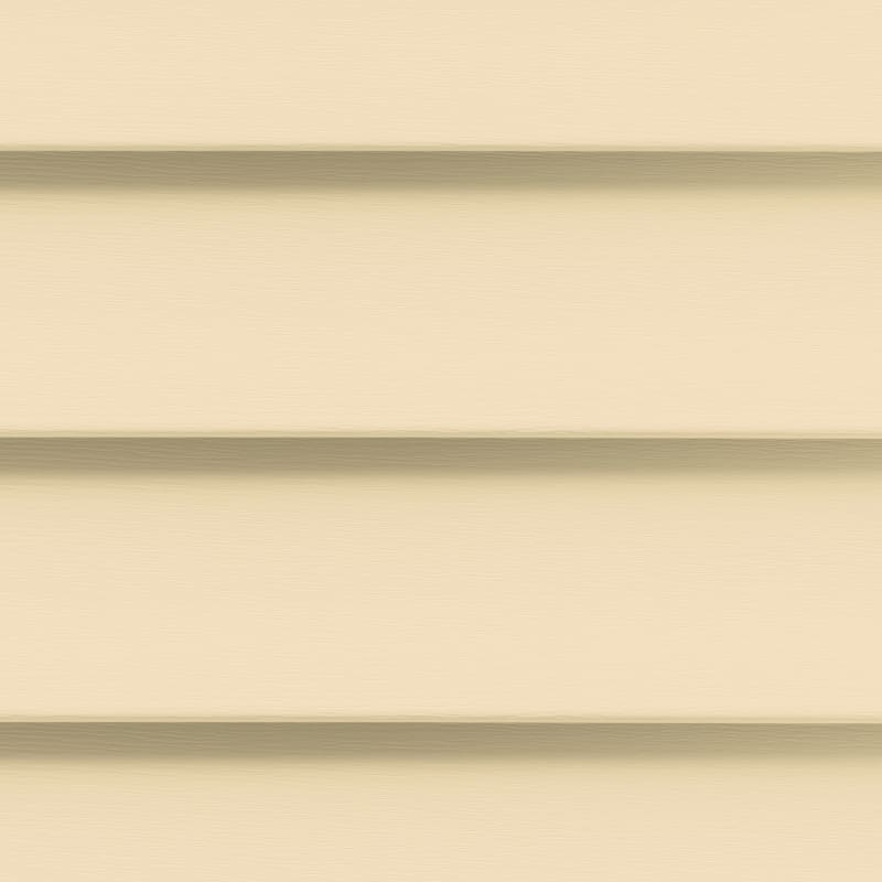
The most popular color for siding installation are light and neutral with white, beige, cream, and light gray seeming to be the most common. After that come darker grays as well as shades of blue, green, earth tones, red, and yellow.
A neutral shade of cream might feel like the safest way to go, but all sorts of colors are appropriate in siding.
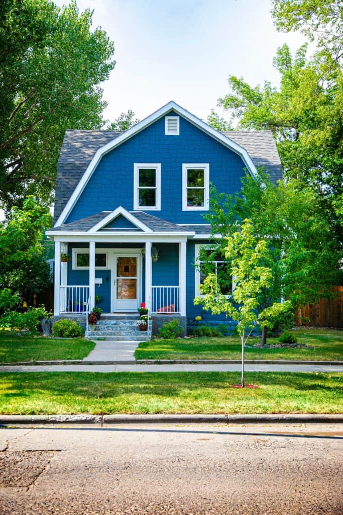
Blues of all shades are incredibly stylish – with siding found in everything from light baby blues and coastal blues to deep executive-worthy indigoes and navy blue.
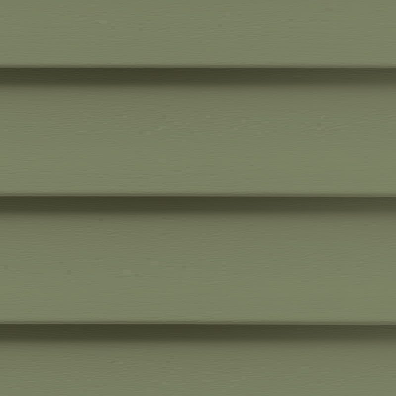
Lighter muted sage greens, mid-tone olive greens, and rich forest greens are sophisticated options.
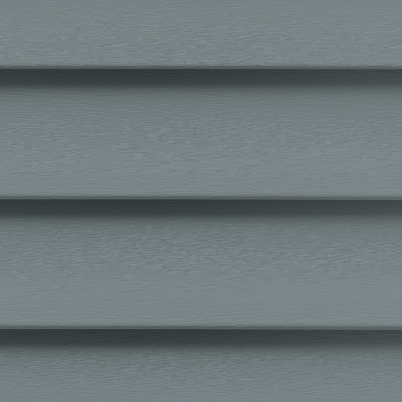
Gray colors are often seen as being sophisticated, elegant, calming, and mature. Earth tones of all shades are calming, grounded, and relaxed.
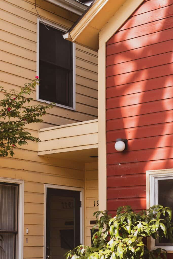
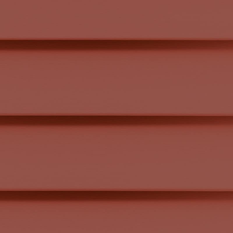
Red is surprisingly versatile and can fit into the countryside, suburbia, or an urban landscape. Deep robust reds look modern while deep muted reds bring a rustic appeal – without looking like a barn.
Yellow brings freshness and charm when on the lighter side, energy when bright, and hominess when it has a touch of mustard.
Bolder dark slates, midnight blues, and black convey upscale taste and a refined aesthetic – at least when used correctly.
Below are some siding colors available in CertainTeed’s American Legend line of siding

What Siding Color Fits Different Architectural Styles?
- Craftsman style fits robust and hearty earth tones. Think olive greens, saturated browns, and rustic bold reds.
- Victorian style works nicely with pastels and lighter shades.
- Tuscan homes blend warm colors with cooler stones.
- Low Country homes feature light and fresh whites, blues, and barely there sage.
- Mediterranean homes have warm terracotta roofs balanced out with softer orange and peach-toned siding.
- French Country homes are versatile but upscale, so stick to natural neutrals with hints of muted blue, green, or yellow.
- Contemporary homes feature sophisticated steels, slates, grays, and blues.
Creating an Exterior Color Palette
Most homes have more than one exterior color. The roof, siding, window frames, doors, garage door, and other elements may be in various colors, but these elements must still be visually cohesive.
For this reason, you shouldn’t choose a siding color without accounting for the colors of your roof, exterior trim, any exterior stone, brick, or wood on the house, and other outdoor elements such as a stone driveway.
Color palettes are great tools for finding multiple colors that work well together.
In a three-color palette, one color is dominant while two are used as complements. This works beautifully for a three-color exterior where the siding, roof, and trim use specific colors. We love this color palette generator it offers 5 colors, consider using the other two colors in your landscaping. This generator will give you a good guide to the three colors of your home’s exterior as well as the direction of colors of plants you could landscape with.
- First color: dominant main color used on the majority or all of siding
- Second color: found on the roof, sections of exterior stone or brick, or a smaller area of siding
- Third color: found on trim around windows, doors, or other accenting features
A four-color palette has one main color, two complementary colors, and an additional accent color. This would look nice for a home where the siding, roof, driveway, and trim use separate colors.
Here’s a little more about color palette options.
Choosing and Working with Colors
Looking for siding and gutter colors that will flatter your roof? Or stuck trying to find the right shade of cream that will brighten up your roof, driveway, and brick accent wall?
You can use color schemes to find colors that play well together and create the visual impact you want.
But before we get into those, here’s an overview of how colors are described and worked with. Understanding these terms can help you determine why a color is or isn’t what you want and make it easier to find the right one.
Hues
A hue is the standard way of referring to a color. Orange, red, pink, blue, and green are all hues.
Tints
A tint is a color or hue that’s been lightened by adding white. Powder blue, baby blue, and pastel blue are all whitened tints of blue.
Shades
A shade is a color that’s been darkened with the addition of black. Dark blue and navy blue are all shades of blue.
Tones
A tone is a color that’s altered with the addition of gray. Slate blue and steel blue are gray-toned blues.
Chromatic Intensity or Saturation
The chroma level is a color’s strength, purity, intensity, or saturation. It can be thought of as a color’s “colorfulness”. For example, pastel yellow is less colorful than a deeper mustard yellow. Eggshell blue is less colorful than a brighter teal blue.
High chroma colors are vivid and intense.
6 Color Schemes
To understand color schemes, it’s helpful to take a look at the color wheel:
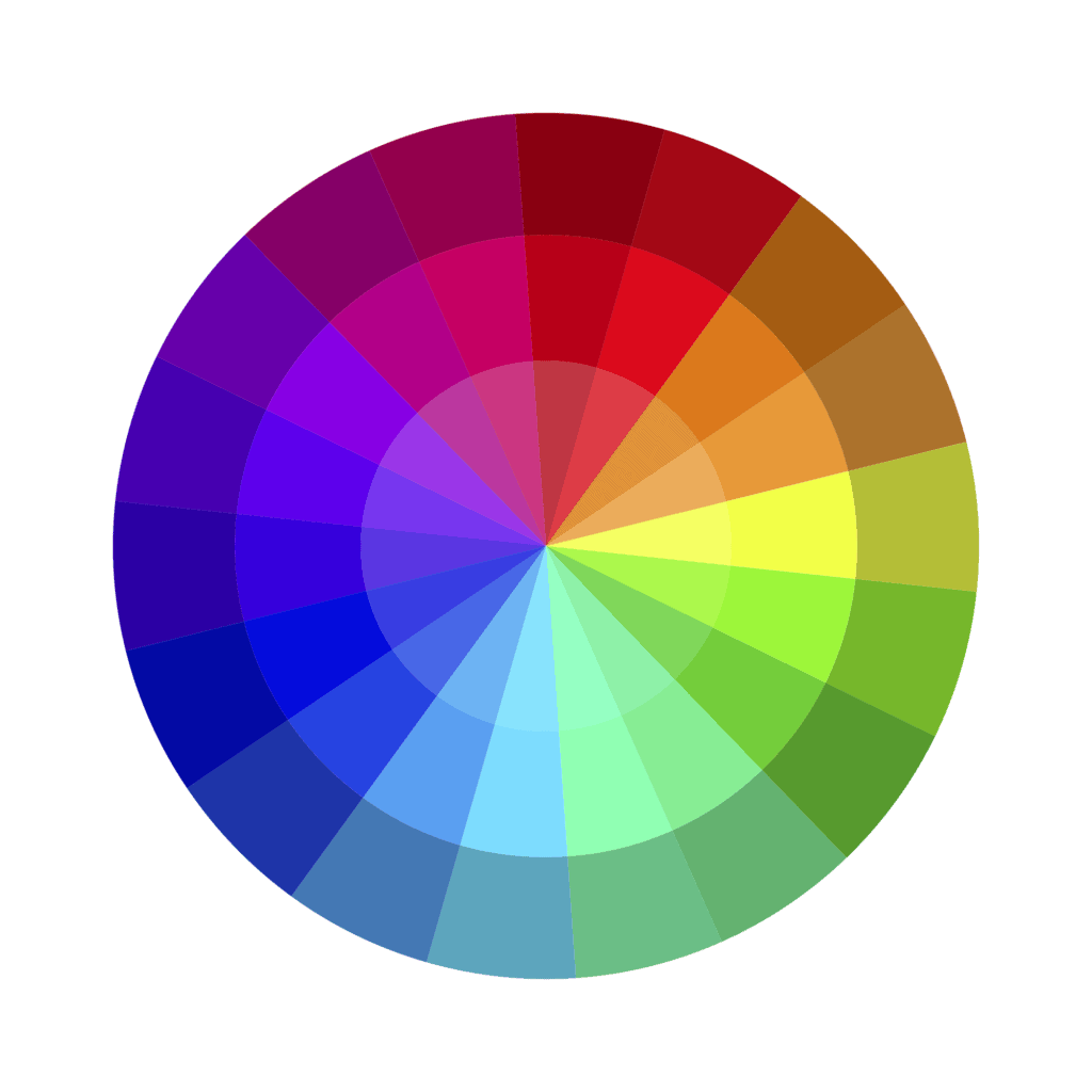
Monochromatic
A monochromatic color scheme uses the same hue in different tints, shades, and tones. You can have as many variations as you want, but it’s probably best to stick to three or four colors. These colors would be from just one or two wedges of the color wheel.
Monochromatic schemes are simple, cohesive, and easy on the eyes.
Analogous
Analogous color schemes use three colors that are next to each other on the color wheel. One is dominant, the second supports, and the third is used to accent. One color from three different touching wedges on the color wheel
These schemes can use colors with the same chroma level or dial certain colors down to let a dominant color stand out.
Complementary
Complementary palettes use two colors from opposing sides of the color wheel. This has a high level of contrast, which can be modified by varying the color intensities. Most common examples are blue and orange/yellow and red-purples and green.
Split Complementary
A split complementary palette uses one main hue accented by two colors found beside its opposing hue. Example: deep blue with yellow and light green or orange.
Triadic
A triadic palette uses three colors that are equally spaced out around the color wheel. (E.g., variations of blue, red, and yellow.)
Tetradic or Double Complementary
A tetradic palette uses four colors equally spaced out across the wheel.
Finding a Siding Color that Compliments Existing Exterior Features
Unless you’re overhauling the entire home exterior, you’re likely to have existing colors that your new siding needs to work with.
Here are a few tips on matching those elements.
Roof colors available
The roof tops the home and it’s a good idea to use lighter siding that’s in the same hue or a contrasting one. For bright pops of color, consider a metal roof installation, for more muted colors go with an asphalt shingle roof installation. Roofs can come in almost any color you can dream of, from reds and blues to whites and black.
- Black roofs go well with stark white, grays, or pastels.
- Gray roofs go well with slate grays, light grays, off-white, and gray-toned blues or greens.
- Brown roofs go well with earth tones and sharper grays.
- Green roofs go well with white, cream, gray, earth tones, and blue.
Eavestroughs, Downspouts, and Gutters
Think of the gutter system as a highlighting feature.
Windows and Doors
Window treatments and doors can be considered an accent. Doors and shutters come in any color you can think of and are easy to change the color of if you get tried of them. Changing the window trims with a fresh coat of paint is also an easy DIY project you can handle yourself.
Brick Accent Wall
Pick up the colors in the brick, then insert those into your color palette. You may want to match how muted or saturated the brick is. If this makes you a little nervous, don’t worry, due to how common brick is it can be thought of as a neutral color.
How to Find the Perfect Siding Color
Start by deciding how many colors you need to find or match your siding to. You can then either choose an existing color to design around or decide what hue the siding will be. After choosing the hue, narrow down the tint, shade, tone, or intensity you prefer. Then use a color scheme tool to build an aesthetically pleasing siding palette.